Mastodon

Dealing with Government of Canada logos on the web

Despite the Government of Canada having a web presence for 30 years now, one of the weirdly persistent problems when building government web applications is how to deal with logos.

The problem is with what is known as “signature blocks”; the combination of flag plus department name (or just “Government of Canada”) that you’ll find at the top of every website.

At first glance, it’s a solved problem, but if you look closely at one of these largely textual logos you’ll notice that it’s a picture: The logos all include an image of text rather than text itself, along with a flag.

This is visible everywhere from the new Design System, to Canada.ca itself, all recycling the same problematic logos.

Given that this is a well known accessibility problem, and doesn’t respect my choice of language (on the web I can specify my language, but the logo images always include both), and doesn’t work for mobile devices (including both languages isn’t good on a small screen)… it’s an odd pattern to see across every government site.

Why would anyone make a picture of text?

Because in 1970, the Federal Identity Program selected Helvetica as the official font of the Government of Canada. An eminently reasonable decision for the centralized team and world of print that existed at the time, this has caused major problems for generations of departmental web developers who then realize that as a commercial font Helvetica can’t legally be used without a license. Given the governments broken procurement process, and the insanity of trying to navigate it for each web application people have opted to simply take a picture of the text instead.

This decision, combined with the fact that the only examples of logos all have both languages because of the FIPs origins in signage and stationary (where users can’t express which language they want to see) have created the bizarre mess we have currently.

Helvetica compatible fonts to the rescue

There have been a few “Helvetica clones” published over the years that allow us to do something reasonable for the web without messing with existing signage.

For our goal of visual compatibility with existing signage, one of the selection criteria is whether they preserve Helvetica’s distinctive “spur” on the capital G, something the words “Government of Canada” will make immediately noticeable. Overused Grotesk does this, and also stands out for having a web-friendly variable font version.

With font in hand, we can solve these accessibility and screen real-estate problems by using a proper font with Government branding.

To show how this can work, here is copy-paste friendly example of setting up Overused Grotesk in a new project so that it’s properly preloaded so that the page loads without the infamous Flash of Unstyled Text (FOUT).

Let’s use Rsbuild to scaffold a basic React application for us.

$ npm create rsbuild@latest

> npx
> create-rsbuild

◆  Create Rsbuild Project
│
◇ Project name or path
│  fontpreload
│
◇ Select framework
│  React 19
│
◇ Select language
│  TypeScript
│
◇ Select additional tools (Use <space> to select, <enter> to continue)
│  Add Biome for code linting and formatting
│
◇ Next steps ─────────────╮
│                          │
│  1. cd fontpreload       │
│  2. git init (optional)  │
│  3. npm install          │
│  4. npm run dev          │
│                          │
├──────────────────────────╯
│
└  All set, happy coding!

In this application we’ll need a copy of that Overused Grotesk font. We can use curl to both download the font put it in static/font which works nicely with Rsbuilds defaults.

curl 'https://raw.githubusercontent.com/RandomMaerks/Overused-Grotesk/refs/heads/main/fonts/variable/OverusedGrotesk-VF.woff2' --create-dirs --output-dir static/font --output OverusedGrotesk-VF.woff2

Rsbuild’s default template doesn’t include a lang attribute on the <html> element, or a <meta> description, so we’ll add a minimalist template in the static folder too.

cat &lt;&lt; EOF &gt; static/index.html
&lt;!doctype html&gt;
&lt;html lang="en"&gt;
  &lt;head&gt;
    &lt;meta name="description" content="Rsbuild application" /&gt;
  &lt;/head&gt;
  &lt;body&gt;
    &lt;div id="&lt;%= mountId %&gt;"&gt;&lt;/div&gt;
  &lt;/body&gt;
&lt;/html&gt;
EOF

Now we’ll add some basic config for Rsbuild, telling it to use our template, skip bundling licence files, and most importantly to preload our font and other assets which is the key to avoid the Flash of Unstyled Text (FOUT).

patch rsbuild.config.ts <<'EOF'
diff --git a/rsbuild.config.ts b/rsbuild.config.ts
index c55b3e1..799d5ae 100644
--- a/rsbuild.config.ts
+++ b/rsbuild.config.ts
@@ -4,4 +4,29 @@ import { pluginReact } from '@rsbuild/plugin-react';
 // Docs: https://rsbuild.rs/config/
 export default defineConfig({
   plugins: [pluginReact()],
+  html: {
+    // use a custom template to address A11y and SEO issues.
+    template: "./static/index.html",
+    tags: [
+      {
+        tag: 'link',
+        attrs: {
+          rel: 'preload',
+          type: 'font/woff2',
+          as: 'font',
+          href: '/static/font/OverusedGrotesk-VF.woff2',
+          crossorigin: 'anonymous',
+        },
+      },
+    ],
+  },
+  output: {
+    // This will prevent .LICENSE.txt files from being generated
+    legalComments: "none",
+    filename: {
+      // Don't use a hash in the font filename, so our tags above can
+      // reference the font files directly.
+      font: "[name][ext]",
+    },
+  },
 });
EOF

Now we include an @font-face rule specifying where we want to load our font from. Rsbuild will run rspack on this file which will normally rewrite the src to point to the bundled file (something like src: url(/static/font/OverusedGrotesk-VF.1656e9bd.woff2)format("woff2");). Including filename.font: "[name][ext]", ensures that it doesn’t add that hash, so the name lines up with the name in our href in the tags section.

patch src/App.css << 'EOF'
 diff --git a/src/App.css b/src/App.css
index 164c0a6..ae9754b 100644
--- a/src/App.css
+++ b/src/App.css
@@ -1,7 +1,15 @@
+@font-face {
+  font-family: "Overused Grotesk";
+  src: url("../static/font/OverusedGrotesk-VF.woff2") format("woff2");
+  font-weight: 300 900;
+  font-style: normal;
+  font-display: fallback;
+}
+
 body {
   margin: 0;
   color: #fff;
-  font-family: Inter, Avenir, Helvetica, Arial, sans-serif;
+  font-family: "Overused Grotesk", Inter, Avenir, Helvetica, Arial, sans-serif;
   background-image: linear-gradient(to bottom, #020917, #101725);
 }
EOF

Now we can add a little text with a capital G, so that it’s easy to see that our font is loaded and used.

patch src/App.tsx << 'EOF'
diff --git a/src/App.tsx b/src/App.tsx
index dff1751..cebdc5b 100644
--- a/src/App.tsx
+++ b/src/App.tsx
@@ -3,7 +3,7 @@ import './App.css';
 const App = () => {
   return (
     <div className="content">
-      <h1>Rsbuild with React</h1>
+      <h1>Rsbuild with Overused Grotesk</h1>
       <p>Start building amazing things with Rsbuild.</p>
     </div>
   );
EOF

And now it’s time to build our production bundle.

$ npm run build

> fontpreload@1.0.0 build
> rsbuild build

  Rsbuild v1.4.8

info    build started...
ready   built in 0.13 s

File (web)                                           Size       Gzip
dist/static/css/index.062da953.css                   0.53 kB    0.34 kB
dist/index.html                                      0.63 kB    0.35 kB
dist/static/js/index.58333bd8.js                     1.3 kB     0.78 kB
dist/static/font/OverusedGrotesk-VF.1656e9bd.woff2   85.1 kB
dist/static/js/lib-react.a4a8b05c.js                 182.8 kB   57.9 kB

                                            Total:   270.4 kB   144.4 kB

To get a sense of what this will look like in production, use npm run preview to get Rsbuild to serve us the production build files it just created in the dist folder. The Lighthouse scores are telling us we did this right.
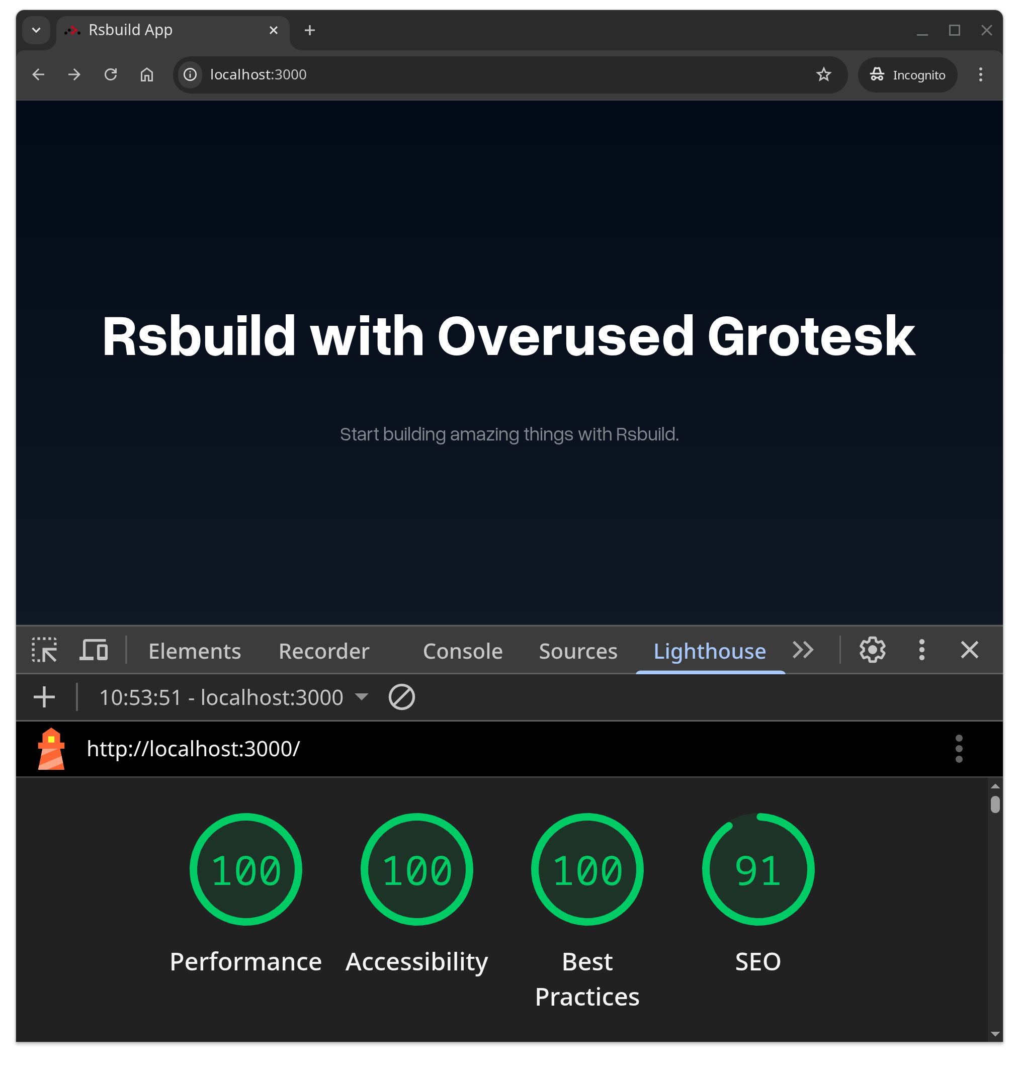
This is pretty good so far. We have a font, and we’re loading it in a way that is good for web performance, but we haven’t really solved the larger problem with logos until we take one final step and make a signature block that uses it.

First, we’ll need to create a React component representing the Canadian flag. You might notice this component is created as a headless component, so that it’s easy to add ARIA attributes (important for accessibility) to and plays nicely with whatever approach you’re using for CSS (something like PandaCSS or Tailwind)

cat << EOF > src/Signature.tsx
import React from "react";

export function SVG({ children, ...props }: React.ComponentProps<"svg">) {
  return (
    <svg
      xmlns="http://www.w3.org/2000/svg"
      preserveAspectRatio="xMinYMin"
      role="img"
      width="65.669"
      height="31.116"
      {...props}
    >
      {children}
    </svg>
  );
}

export function Flag(props: React.ComponentProps<"path">) {
  return (
    <path
      {...props}
      d="m30.675 6.467 2.223-4.443 2.206 4.281c.275.452.499.415.938.2l1.898-.921-1.234 5.977c-.258 1.174.422 1.518 1.162.722l2.705-2.837.718 1.605c.241.485.605.415 1.086.328l2.794-.577-.938 3.464v.074c-.11.453-.33.83.186 1.05l.993.485-5.782 4.783c-.587.593-.384.776-.164 1.444l.532 1.605-5.372-.954c-.663-.162-1.124-.162-1.14.361l.219 6.048h-1.614l.22-6.031c0-.594-.461-.577-1.547-.357l-4.983.937.642-1.605c.22-.614.279-1.029-.22-1.444l-5.87-4.716 1.086-.651c.313-.237.33-.486.165-1.013l-1.104-3.505 2.831.593c.79.183 1.01 0 1.213-.414l.79-1.59 2.799 3.07c.494.577 1.196.2.976-.63l-1.344-6.48 2.08 1.174c.329.2.68.253.883-.124M50.099 0h15.57v31.116h-15.57ZM0 0h15.57v31.116H0Z"
    />
  );
}
EOF

And finally we’ll import that into our App component to create a our new signature block. Notice how we can add styles and ARIA attributes as needed, without worrying about a customizability wall.

patch src/App.tsx << 'EOF'
diff --git a/src/App.tsx b/src/App.tsx
index cebdc5b..f9f58f9 100644
--- a/src/App.tsx
+++ b/src/App.tsx
@@ -1,9 +1,26 @@
 import './App.css';
+import { Flag, SVG } from "./Signature.tsx";

 const App = () => {
   return (
-    <div className="content">
-      <h1>Rsbuild with Overused Grotesk</h1>
+    <div className="content" style={{ justifySelf: "center" }}>
+      <section
+        style={{ display: "flex" }}
+      >
+        <SVG>
+          <title>Canadian Flag</title>
+          <Flag style={{ fill: "#ea2d37" }} />
+        </SVG>
+        <span
+          style={{
+            paddingLeft: "0.8em",
+            lineHeight: "1em",
+            textAlignLast: "left",
+          }}
+        >
+          Government of<br /> Canada
+        </span>
+      </section>
       <p>Start building amazing things with Rsbuild.</p>
     </div>
   );
EOF

The result is super satisfying, a razor-sharp and accessible signature block looks great at any zoom level and on any screen size. It’s easily styled, and works really well with internationalization libraries like the one I covered in a previous post.

Using an Open Source font to maintain visual compatibility with FIP feels like win-win: Nobody needs to change physical signage/letterhead, lingering accessibility problems can be solved and the user experience for every government web site improves a little… all for a cost of $0.

A look at the React Lifecycle

Every react component is required to provide a render function. It can return false or it can return elements but it needs to be there. If you providing a single function, it’s assumed to be a render function:

const Foo = ({thing}) =&gt; &lt;p&gt;Hello {thing}&lt;/p&gt;
&lt;Foo thing=&quot;world&quot; /&gt;

There has been a fair bit written about the chain of lifecycle methods that React calls leading up to it’s invocation of the render function and afterwards. The basic order is this:

constructor
render
componentDidMount

But things are rarely that simple, and often this.setState is called in componentDidMount which gives a call chain that looks like this:

constructor
render
componentDidMount
shouldComponentUpdate
componentWillUpdate
render
componentDidUpdate

Nesting components inside each other adds another wrinkle to this, as does my use of ES6/7, which adds a few subtle changes to the existing lifecycle methods. To get this sorted out in my own head, I created two classes: an Owner and and Ownee.

class Owner extends React.Component {

  // ES7 Property Initializers replace getInitialState
  //state = {}

  // ES6 class constructor replaces componentWillMount
  constructor(props) {
    super(props)
    console.log(&quot;Owner constructor&quot;)
    this.state = {
      foo: &quot;baz&quot;
    }
  }

  componentWillReceiveProps(nextProps) {
    console.log(&quot;Owner componentWillReceiveProps&quot;)
  }

  shouldComponentUpdate(nextProps, nextState) {
    console.log(&quot;Owner shouldComponentUpdate&quot;)
    return true
  }

  componentWillUpdate(nextProps, nextState) {
    console.log(&quot;Owner componentWillUpdate&quot;)
  }

  shouldComponentUpdate(nextProps, nextState) {
    console.log(&quot;Owner shouldComponentUpdate&quot;)
    return true
  }

  render() {
    console.log(&quot;Owner render&quot;)
    return (
      &lt;div className=&quot;owner&quot;&gt;
        &lt;Ownee foo={ this.state.foo } /&gt;
      &lt;/div&gt;
    )
  }

  componentDidUpdate(nextProps, nextState) {
    console.log(&quot;Owner componentDidUpdate&quot;)
  }

  componentDidMount() {
    console.log(&quot;Owner componentDidMount&quot;)
  }

  componentWillUnmount() {
    console.log(&quot;Owner componentWillUnmount&quot;)
  }

}

A component is said to be the owner of another component when it sets it’s props. A component whose props are being set is an ownee, so here is our Ownee component:

class Ownee extends React.Component {

  // ES6 class constructor replaces componentWillMount
  constructor(props) {
    super(props)
    console.log(&quot;  Ownee constructor&quot;)
  }

  componentWillReceiveProps(nextProps) {
    console.log(&quot;  Ownee componentWillReceiveProps&quot;)
  }

  shouldComponentUpdate(nextProps, nextState) {
    console.log(&quot;  Ownee shouldComponentUpdate&quot;)
    return true
  }

  componentWillUpdate(nextProps, nextState) {
    console.log(&quot;  Ownee componentWillUpdate&quot;)
  }

  render() {
    console.log(&quot;  Ownee render&quot;)
    return (
        &lt;p&gt;Ownee says {this.props.foo}&lt;/p&gt;
    )
  }

  componentDidUpdate(nextProps, nextState) {
    console.log(&quot;  Ownee componentDidUpdate&quot;)
  }

  componentDidMount() {
    console.log(&quot;  Ownee componentDidMount&quot;)
  }

  componentWillUnmount() {
    console.log(&quot;  Ownee componentWillUnmount&quot;)
  }

}

This gives us the following chain:

Owner constructor
Owner render
  Ownee constructor
  Ownee render
  Ownee componentDidMount
Owner componentDidMount

Adding this.setState({foo: "bar"}) into the Owner’s componentDidMount gives us a more complete view of the call chain:

Owner constructor
Owner render
  Ownee constructor
  Ownee render
  Ownee componentDidMount
Owner componentDidMount
Owner shouldComponentUpdate
Owner componentWillUpdate
Owner render
  Ownee componentWillReceiveProps
  Ownee shouldComponentUpdate
  Ownee componentWillUpdate
  Ownee render
  Ownee componentDidUpdate
Owner componentDidUpdate

Things definitely get more complicated when components start talking to each other and passing functions that setState but the basic model is reassuringly straight forward. The changes that ES6/7 bring to the React lifecycle are relatively minor but nonetheless nice to have clear in my head as well.
If you want to explore this further I’ve created a JSbin.

D3 and React 3 ways

D3 and React are two of the most popular libraries out there and a fair bit has been written about using them together.
The reason this has been worth writing about is the potential for conflict between them. With D3 adding and removing DOM elements to represent data and React tracking and diffing of DOM elements, either library could end up with elements being deleted out from under it or operations returning unexpected elements (their apparent approach when finding such an element is “kill it with fire“).

One way of avoiding this situation is simply telling a React component not to update it’s children via shouldComponentUpdate(){ return false }. While effective, having React manage all the DOM except for some designated area doesn’t feel like the cleanest solution. A little digging shows that there are some better options out there.

To explore these, I’ve taken D3 creator Mike Bostock’s letter frequency bar chart example and used it as the example for all three cases. I’ve updated it to ES6, D3 version 4 and implemented it as a React component.

letter_frequency
Mike Bostock’s letter frequency chart

Option 1: Use Canvas

One nice option is to use HTML5’s canvas element. Draw what you need and let React render the one element into the DOM. Mike Bostock has an example of the letter frequency chart done with canvas. His code can be transplanted into React without much fuss.

class CanvasChart extends React.Component {

  componentDidMount() {
    //All Mike's code
  }

  render() {
    return &lt;canvas width={this.props.width} height={this.props.height} ref={(el) =&gt; { this.canvas = el }} /&gt;
  }
}

I’ve created a working demo of the code on Plunkr.
The canvas approach is something to consider if you are drawing or animating a large amount of data. Speed is also in it’s favour, but React probably narrows the speed gap a bit.

A single element is produced since the charts are drawn with Javascript no other elements need be created or destroyed, avoiding the conflict with React entirely.

Option 2: Use react-faux-dom

Oliver Caldwell’s react-faux-dom project creates a Javascript object that passes for a DOM element. D3 can do it’s DOM operations on that and when it’s done you just call toReact() to return React elements. Updating Mike Bostock’s original bar chart demo gives us this:

import React from 'react'
import ReactFauxDOM from 'react-faux-dom'
import d3 from 'd3'

class SVGChart extends React.Component {

  render() {
    let data = this.props.data

    let margin = {top: 20, right: 20, bottom: 30, left: 40},
      width = this.props.width - margin.left - margin.right,
      height = this.props.height - margin.top - margin.bottom;

    let x = d3.scaleBand()
      .rangeRound([0, width])

    let y = d3.scaleLinear()
      .range([height, 0])

    let xAxis = d3.axisBottom()
      .scale(x)

    let yAxis = d3.axisLeft()
      .scale(y)
      .ticks(10, &quot;%&quot;);

    //Create the element
    const div = new ReactFauxDOM.Element('div')
    
    //Pass it to d3.select and proceed as normal
    let svg = d3.select(div).append(&quot;svg&quot;)
      .attr(&quot;width&quot;, width + margin.left + margin.right)
      .attr(&quot;height&quot;, height + margin.top + margin.bottom)
      .append(&quot;g&quot;)
      .attr(&quot;transform&quot;, `translate(${margin.left},${margin.top})`);

      x.domain(data.map((d) =&gt; d.letter));
      y.domain([0, d3.max(data, (d) =&gt; d.frequency)]);

    svg.append(&quot;g&quot;)
      .attr(&quot;class&quot;, &quot;x axis&quot;)
      .attr(&quot;transform&quot;, `translate(0,${height})`)
      .call(xAxis);

    svg.append(&quot;g&quot;)
      .attr(&quot;class&quot;, &quot;y axis&quot;)
      .call(yAxis)
      .append(&quot;text&quot;)
      .attr(&quot;transform&quot;, &quot;rotate(-90)&quot;)
      .attr(&quot;y&quot;, 6)
      .attr(&quot;dy&quot;, &quot;.71em&quot;)
      .style(&quot;text-anchor&quot;, &quot;end&quot;)
      .text(&quot;Frequency&quot;);

    svg.selectAll(&quot;.bar&quot;)
      .data(data)
      .enter().append(&quot;rect&quot;)
      .attr(&quot;class&quot;, &quot;bar&quot;)
      .attr(&quot;x&quot;, (d) =&gt; x(d.letter))
      .attr(&quot;width&quot;, 20)
      .attr(&quot;y&quot;, (d) =&gt; y(d.frequency))
      .attr(&quot;height&quot;, (d) =&gt; {return height - y(d.frequency)});

    //DOM manipulations done, convert to React
    return div.toReact()
  }

}

This approach has a number of advantages, and as Oliver points out, one of the big ones is being able to use this with Server Side Rendering. Another bonus is that existing D3 visualizations hardly need to be modified at all to get them working with React. If you look back at the original bar chart example, you can see that it’s basically the same code.

Option 3: D3 for math, React for DOM

The final option is a full embrace of React, both the idea of components and it’s dominion over the DOM. In this scenario D3 is used strictly for it’s math and formatting functions. Colin Megill put this nicely stating “D3’s core contribution is not its DOM model but the math it brings to the client”.

I’ve re-implemented the letter frequency chart following this approach. D3 is only used to do a few calculations and format numbers. No DOM operations at all. Creating the SVG elements is all done with React by iterating over the data and the arrays generated by D3.

Screenshot from 2016-06-02 09-24-34
My pure React re-implementation of Mike Bostock’s letter frequency bar chart. D3 for math, React for DOM. No cheating.

What I learned from doing this, is that D3 does a lot of work for you, especially when generating axes. You can see in the code there is a fair number of “magic values”, a little +5 here or a -4 there to get everything aligned right. Probably all that stuff can be cleaned up into props like “margin” or “padding”, but it’ll take a few more iterations (and possibly actual reuse of these components) to get that stuff all cleaned up. D3 has already got that stuff figured out.

This approach is a lot of work in the short term, but has some real benefits. First, I like this approach for it’s consistency with the React way of doing things. Second, long term, after good boundaries between components are established you can really see lots of possibilities for reuse. The modular nature of D3 version 4 probably also means this approach will lead to some reduced file sizes since you can be very selective about what functions you include.
If you can see yourself doing a lot of D3 and React in the future, the price paid for this purity would be worth it.

Where to go from here

It’s probably worth pointing out that D3 isn’t a charting library, it’s a generic data visualisation framework. So while the examples above might be useful for showing how to integrate D3 and React, they aren’t trying to suggest that this is a great use of D3 (though it’s not an unreasonable use either). If all you need is a bar chart there are libraries like Chart.js and react-chartjs aimed directly at that.

In my particular case I had and existing D3 visualization, and react-faux-dom was the option I used. It’s a perfect balance between purity and pragmatism and probably the right choice for most cases.

Hopefully this will save people some digging.